In the sprawling galaxy of Star Wars Outlaws, where the promise of a first-of-its-kind open-world adventure beckons, a familiar specter lingers at the edge of the screen. It is a specter of guidance, of a persistent hand-holding that, for all the game's vastness and detail, subtly undermines the very immersion it seeks to create. While the game offers a commendable array of options to strip away many layers of its user interface, allowing players to navigate hostile territories with a thrilling sense of uncertainty, one particular element remains stubbornly, almost defiantly, present: the platforming button prompt.
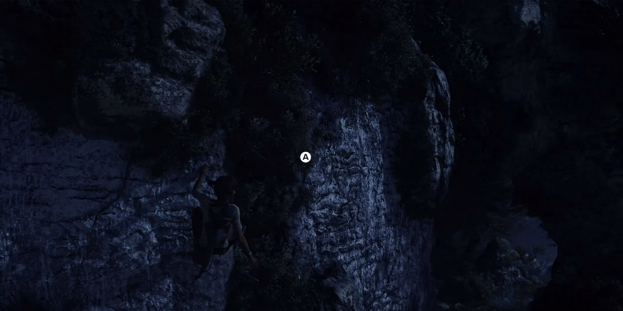
This small, glowing indicator, appearing each time protagonist Kay Vess approaches a ledge or a gap, is more than a minor nuisance. It stands as a poignant symbol of a design philosophy that Ubisoft, despite notable strides, has yet to fully transcend. The ability to disable enemy detection markers and compasses transforms stealth into a tense dance of observation and risk, a testament to the game's potential for organic engagement. Yet, the platforming prompt feels like a relic, a vestigial tail of a system that does not trust the player to remember a simple, universal control. It whispers that this world, for all its beauty, is still a series of designated interactions rather than a cohesive space to be intuitively understood and navigated.
The journey to this point has been long. For years, Ubisoft's worlds grew in scale and complexity, and with them grew a creeping anxiety—a fear that players might become lost or confused. The solution was often brute force: a cluttered heads-up display (HUD) that painted objectives, markers, and indicators directly onto the screen. This approach, while functional, robbed experiences of discovery. The joy of natural pathfinding, of looking at a landscape and discerning a route from its architecture and contours, was often sacrificed at the altar of absolute clarity. Even when toggles were offered, they were frequently tangled, bundling essential feedback with unnecessary clutter, making a truly minimalist playthrough an exercise in frustration.

Recent titles like Assassin's Creed Mirage and Avatar: Frontiers of Pandora have shown a conscious effort to pull back, to design with more subtlety. Star Wars Outlaws continues this trend in many brilliant ways. Its option to remove the ubiquitous "yellow paint" highlighting climbable surfaces is a genuine triumph, encouraging players to actually see their environment. This makes the persistent platforming prompts all the more jarring. They feel like a Band-Aid, covering a potential uncertainty in the game's own environmental language. They highlight a world where some jumps are "correct" and others are not, a design that feels restrictive compared to the free-form vertical playgrounds offered by other modern adventures.
What makes this limitation particularly poignant is its contrast with what the game does well. The suite of UI options is largely thoughtful. Turning off the HUD can make the galaxy feel more vast and dangerous, a place where survival depends on wits and observation. Yet, that final step toward complete immersion is halted by a prompt that says, in effect, "press here now." Other narratives in gaming have solved this elegantly. The Uncharted series, for instance, uses protagonist animation and environmental storytelling to guide movement with a naturalistic flow. Nathan Drake's posture, his glances, the wear on certain ledges—all communicate possibility without a single icon. Star Wars Outlaws possesses the detail and artistry to achieve this, but in these moments, it defaults to a directive.
| Design Approach | Effect on Immersion | Example |
|---|---|---|
| Minimalist Environmental Cues | High - Encourages observation and organic discovery | The Legend of Zelda: Breath of the Wild |
| Animated Character Guidance | High - Uses body language to suggest paths | Uncharted 4: A Thief's End |
| Persistent UI Prompts | Low - Interrupts flow, treats interaction as a command | Star Wars Outlaws platforming |
| Configurable UI Toggles | Medium - Empowers player choice but can reveal core design reliance | Star Wars Outlaws stealth options |
It is a curious tension. Ubisoft stands on the precipice of a more mature design language, one that respects player intelligence and fosters deep, personal investment in its worlds. The tools are there: detailed environments, configurable settings, and compelling core gameplay. Yet, the persistence of elements like the platforming prompt suggests a lingering institutional habit, a tendency to settle for "good enough" in the finer points of interaction when the monumental task of building the world itself is complete. For a game that casts you as a cunning scoundrel navigating the margins of the galaxy, it is ironically these small, persistent guides that can make the experience feel the most scripted.
Ultimately, the story of Star Wars Outlaws' user interface is a microcosm of a larger evolution. It is a tale of two steps forward and one hesitant step back. The game offers a galaxy teeming with life and opportunity, a place where you can, for glorious moments, feel truly lost in the role of Kay Vess. But then you reach a gap, and a glowing symbol appears, a small reminder that you are still following a path someone else has explicitly marked. True immersion is sold on the feeling of natural interaction, on the belief that the world reacts to you because you understood it, not because you obeyed an icon. In 2026, as open-world games continue to push boundaries, the most revolutionary step a developer can take might not be making a world bigger, but trusting the player to navigate it with a little less guidance and a lot more wonder.